
Tips & Techniques: Blended Ink Titles | Nancy Damiano
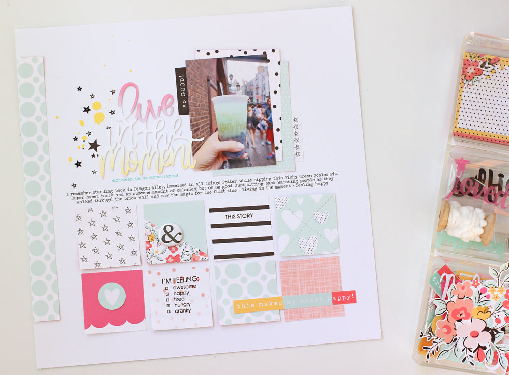
It's time to take out the inks and play! Let's combine a simple art blending technique into a scrapbook layout. I started this design by cutting out the beautiful free cut file by our guest designer, Alex Hunter which can be found here for free!

I cut the title out five times out of white cardstock in the same size. Stacking these and adhering them together will add some texture to the title so that appears more like an epoxy title rather than plain, flat paper.
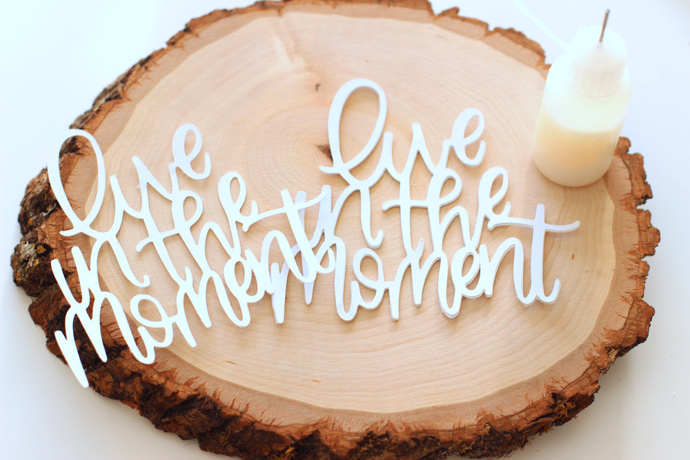
I used Multi Medium Matte adhesive and a needle nose bottle to adhere the layers. I like the precision that the needle tip gives and this matte medium dries completely clear (even if you go outside the lines). Remember to set aside one of the die cuts to use for your top layer of ink blending. We'll adhere that one last.
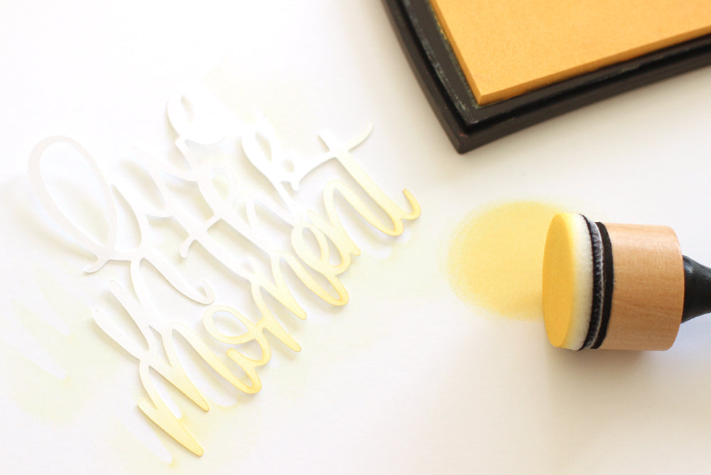
I used pigment ink and a foam blending tool to get this smooth coverage. I also like Distress Ink for this technique. The trick here is to pick up a little ink and dab some off. It's best to apply thin layers of color. If you try to ink fast and furious, you'll get blotches. Here I lightly inked the bottom in yellow and the very top in pink to coordinate with the colors in the Felicity Kit.
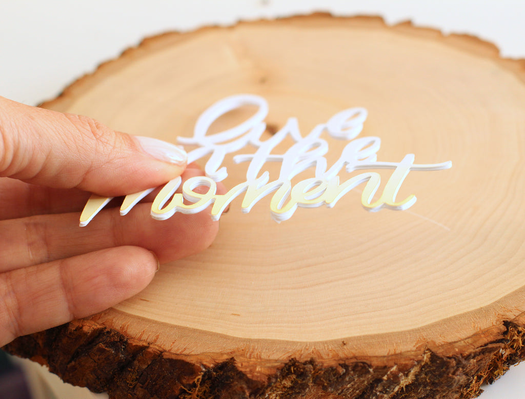
Adhere the very top layer and you've completed a custom embellishment that's anything but flat! Here you can see just how much dimension it has. The title will really pop!
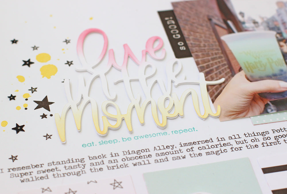
The story here is about "living in the momen", sipping a cool drink in Diagon Alley Universal Studios and just watching the world go by. I added a little themed nod to the wizard theme with a sprinkle of black stars (stamped, acetate and sequins) and some drops of gold paint.
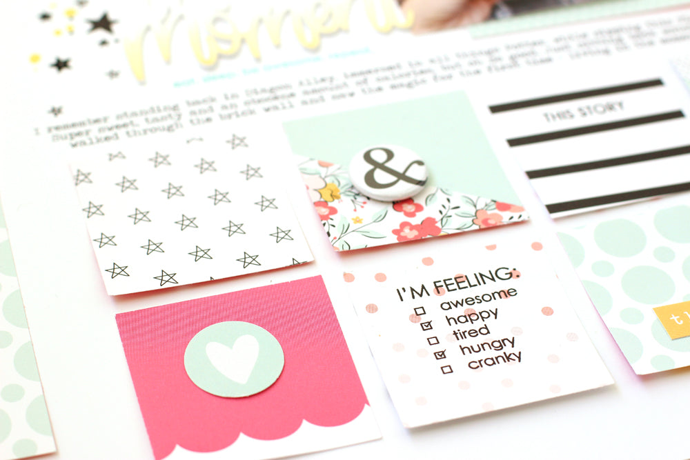
My favorite go-to design is a simple grid. It's clean lines, pops of color and bits of fun embellishment make for pretty pages that are quick to create.
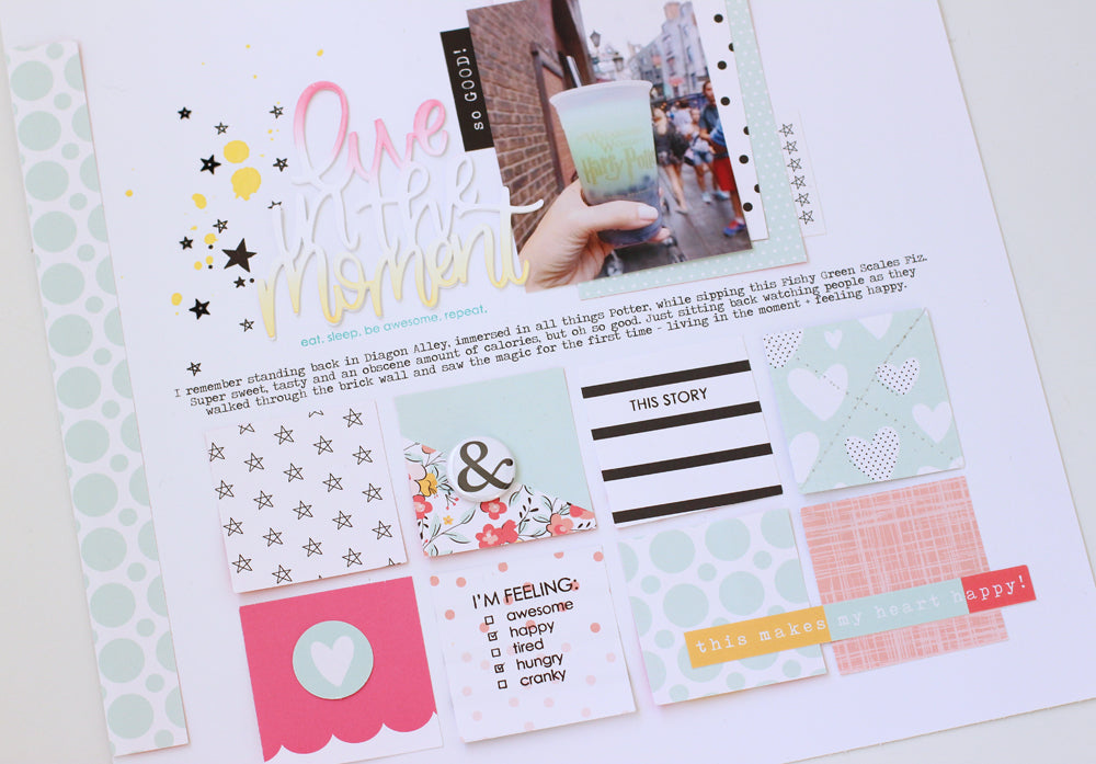
Who knew Harry Potter and Felicity Jane would make such a beautiful pair!
SUPPLIES | Felicity Jane Kit | Felicity Stamp | FJ Acetate Shapes |
