Guest Designer | Amberleigh Smith
Hello Everyone! My name is Amberleigh and I am honored and excited to serve as the Felicity Jane Studio Guest Designer for the month of May. Thank you so very much for having me and allowing me the opportunity to share my creations here with you.
Fun fact, I’m an exclusively digital memory keeper! It’s a choice I made in 2019 and I haven’t looked back since, and I love that Felicity Jane offers digital collections for memory keepers like myself.
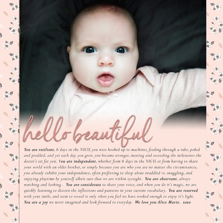
For my first project this month, I created a 12x12 layout for my daughters baby book using Photoshop Elements. The Jill digital collection colors and sentiments immediately called me to document a special photo I had favorited in my camera roll. 
The soft pinks mimicked the color of her onsie and the greys complimented the pillow she’s laying on. The “Hello Beautiful” sentiment is exactly how I feel when I see this photo and the ‘You are Enough’ journaling card provided the inspiration for the story I wanted to tell. Gotta’ love it when a journaling card inspires your journaling!
I started this layout with the journaling. My preference is to use a 18pt Perpetua Italic font on layouts like this where I really want the words to be a focus so I knew I needed to start there. I typed it all out and added it to the blank 12x12 canvas to better gauge how the rest of the layout would come together.
From there I also knew I wanted the single photo to be large and take center stage. So I added it to the top of my layout above the journaling. Ta-Da! My layout foundation is complete, and now I can move on to embellishments and making the page beautiful.
I added the floral paper (digital paper 09) to the background and the solid light pink paper (digital paper 14) to the journaling section. Then added the ‘Hello Beautiful’ stamp to the point where the photo and journaling paper came together.
At this point, I’m really liking the page, but not quite loving it. The line between the photo and journaling seems too abrupt and the Hello Beautiful title stamp seems too harsh in black. So I make a couple tweaks to the page.
First, I added a gradient layer mask to the photo. This is what results in the blend effect and softens the transition between the photo and the light pink paper that holds the journaling. Can you see the subtle difference?
Second, I recolored the title. There are several ways to do this, but I chose to use the Jill Digital Papers as clipped layers to recolor the stamp. First, I tried the light grey (digital paper 15), and that didn’t quite do it for me. So, then I tried the deeper rose (digital paper 13), and that did it!
Both color choices would have worked, but I chose the rose color because I felt like it pulled in the darker pink from her lips and the darker pink from the floral patterned paper. That paired with the black journaling font helps the page feel balanced, and I am positively thrilled with the result. 
The final layout is everything I wanted it to be. Story Focused. Clean and Simple. Modern and Feminine. I can only hope that one day, when my daughter is flipping through her baby book, she can feel all the love that went into crafting the page, and appreciate just how much I love and enjoy creating layouts like this to share with her. 
Amberleigh Smith - Guest Designer for May 2020
SUPPLIES: Jill Digital Kit


