Happy Layout | Andrea Gray
Hello sweet friends! How are you all enjoying the Mila kit? Isn't it just gorgeous?
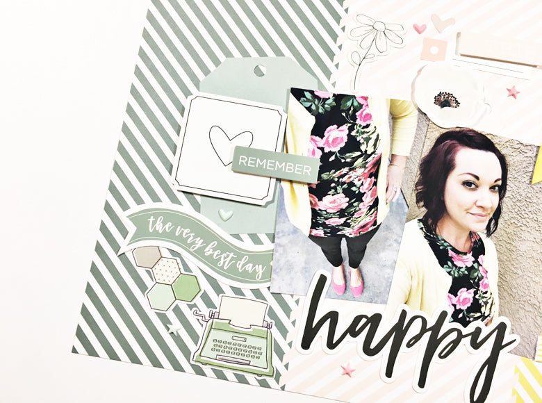
Today I am sharing a 12x12 layout and it's all about tone on tone color! The focus was supposed to be the photos of my outfit that happen to be a PERFECT match - but that changed once I started laying things out.

I started with the diagonal & dots patterned paper and began to pull out anything that was green, pink or yellow. I paid close attention to the tone of the colors since these are a bit muted.

Once I assessed all the embellishments I had picked out, I realized that I wanted to keep the colors together instead of trying to cluster and spread the color around.

Keeping the colors together was a little challenging - but only for a quick second because I ended up having a blast figuring out how to make each piece stand out against the same tone background.


I highly encourage you to try setting your embellishments on the same color background. It creates a soothing background to really make your photos pop!

Hope you have a super creative week!
Andrea
Supplies: October Mila Kit | Mila Paper Pack | Mila Die Cut Shapes | Mila Journaling Cards | Willow Die Cut Shapes

3 comments
Such a colorful, fun layout!!!
This is amazing! The tone on tone is just beautiful!
Andrea, You never cease to amaze me with your talent and your design is SO inspiring! I love this layout and am going to try it out soon!! Of course all the Felicity Jane product is GORGEOUS!! Love, one of your biggest fans, Mandy