Mixed Backgrounds | Nancy Damiano
Hey there Felicity fans, Nancy here today with a design tip to spice up your layout backgrounds. I love floral patterns, but I find myself shuffling them around trying to find a balance between "too much" and "not enough". I wanted to try something new that wasn't fussy cutting or cutting up the pattern into small bits.

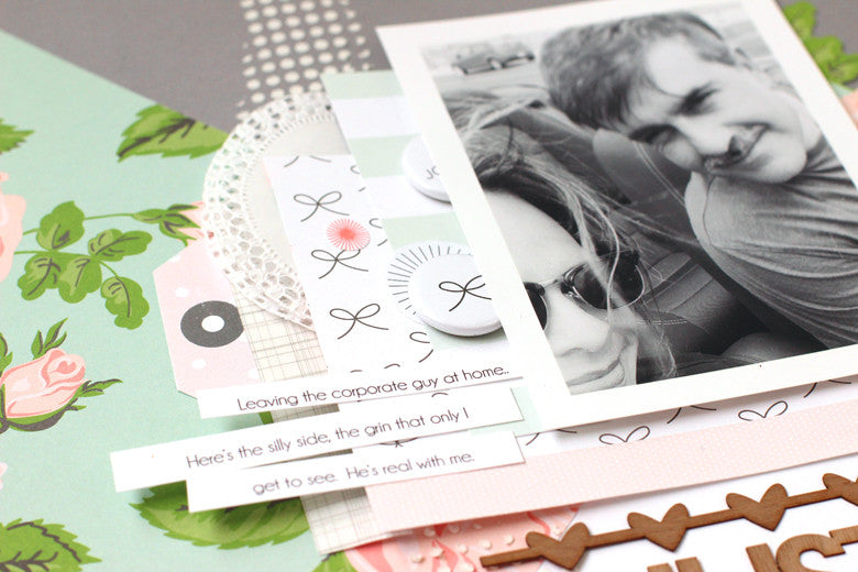
That's when I got the bright idea to create a diagonal quadrant. By cutting the floral pattern into a triangle to cover 1/4 of the background, the pattern shines without taking over the entire design. The light and airy pattern is offset by the dark gray solid paper from the kit. A tiny dot mask and modeling paste creates a nice vertical line that ties all of the colors and pattern together.
 The background is bold in color and lines, so the photo really needed layers to frame it out. I wanted to make sure that the photo wasn't overwhelmed by all that design. I started with two layers of patterned paper and then tucked in all kinds of goodness (a tag from the sticker sheet, flair and washi tape). I cut the fringe off of the doily in the kit to give it a cleaner look and placed it between the layers. I like that circle shape sticking out amongst all of the clean, straight lines. Contrast is always good!

I love the color and grain of the wood veneer title. The words were perfect for this story and photo. I underlined the photo with the veneer heart strip to give it a shelf to rest on. It highlights both the photo and the title just underneath.

The last touch is the large flower that was fussy cut from the floral pattern and tucked just under the subject of the layout. Highlighting him, the pattern and dragging some of that floral goodness onto the pink triangle.
Be bold and embrace large patterns, they are beautiful and easier to use than you think. Using the diagonal quadrant is a great way to mix up colors and patterns. Use it the next time your stumped for a background!
SUPPLIES | Jane Kit | Solid Color Paper Add On | Jane Washi Strips | Jane Stamp

1 comment
Beautiful and unique !!!