Use Your Words | Nancy Damiano
Let's talk titles, beautiful staggered ones that add a pop to your designs. Anytime I find myself searching for an original layout idea, I start with the words. The words + photos are always my main focus. The rest of it is the icing!
 One of the first items that jumped out at me from the Jane kit was this intricate die cut. I love how it drapes all the way across the page underlining the photo. It's the perfect title with a wow factor. I grabbed this first and built the rest of the design around it.

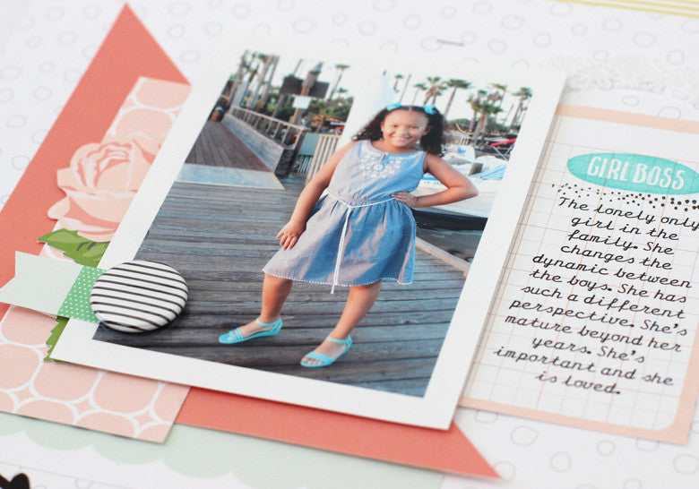
To make this photo of my niece pop, I added a bed of layers in the pretty patterns from this month's kit. Initially all of the layers were squares and rectangles. I cut one of those squares diagonally and used this triangle to break up all of the straight square lines. The one shape adds impact to the top of the design. I tucked a handout flower just under the photo, added a die cut flag and anchored it all with a bold black and white stripe flair button. Hello beautiful layers!

At this point, I had a large, blank space just under the title. What to do, what to do? I looked over at the stamp set and thought - maybe some words. More words are a good thing. I lined up the stamped sentiments right in the center just under the word "loved". Using different colors of ink adds a pop to otherwise very white space.
 Words + design are where it's at. Use them up, center them, stamp them. The next time you break open a kit, go for the words first and make the centerpiece of your design.
SUPPLIES | Jane Kit | Solid Color Paper Add On | Jane Washi Strips | Jane Stamp

1 comment
EXcellent title!!