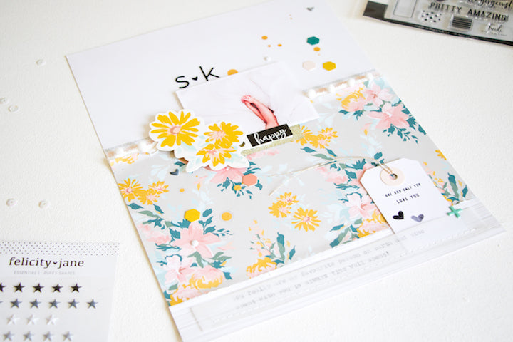
S + K, a Clean and Minimalist Layout | Kathleen Graumüller
Hey there :) It’s Kathleen here and today I have a very clean and minimalist layout for you. I wanted the look and feel of the layout to fit that of the photo, so I chose to keep it simple.

I started by cutting down a big piece of that gorgeous floral paper and putting it on my white cardstock so it would cover a little bit more than half of the page. I ruffled up the edges a bit and then added a strip of the wood veneer paper to the bottom of the page and a slightly thinner strip of the pink/white polka dot paper to the top of the floral paper.
To add some more details and texture, I also used some of the pretty white pompom trim from the Felicity kit and stamped the border stamp from the Heidi stamp set in gray. I used the same technique as on my last layout to add my journaling: my typewriter + a piece of vellum.

Because I wanted to keep my layout really light and airy, I chose the black puffy alphabet from the Zoey kit and also scattered some of the bitty puffy shapes from that kit across the page, together with the hexagon ephemera pieces from the Heidi kit.

One thing that all my pages have in common is mist splatters, so I finished off my page by sprinkling some of that divine golden Heidi Swapp color shine across my page. You will notice that the paint splatters and the little bits and pieces (i.e. puffy shapes + die cuts) go in a diagonal line from bottom left to top right corner - this is a great way to direct the eyes of the viewer across the page and give him/her some direction rather than having their view jump across the page from one part to another.
Kathleen
Supplies: September Heidi Kit | Heidi Paper Pack | Heidi Die Cut Shapes | Heidi Story Tags | Heidi Stamp Set | Zoey Black Puffy Alphabet | Essentials Bitty Puffy Stickers
