Vertical Design Tips | Nancy Damiano
Let's talk about vertical designs - the ones that area clean and angular with lots of space for decorating and telling stories. I chose this type of design because I'm in love with this alphabet from the Caroline kit. The font, the color, the size - it's absolute perfection. What better way to show it off than to bring it center stage!
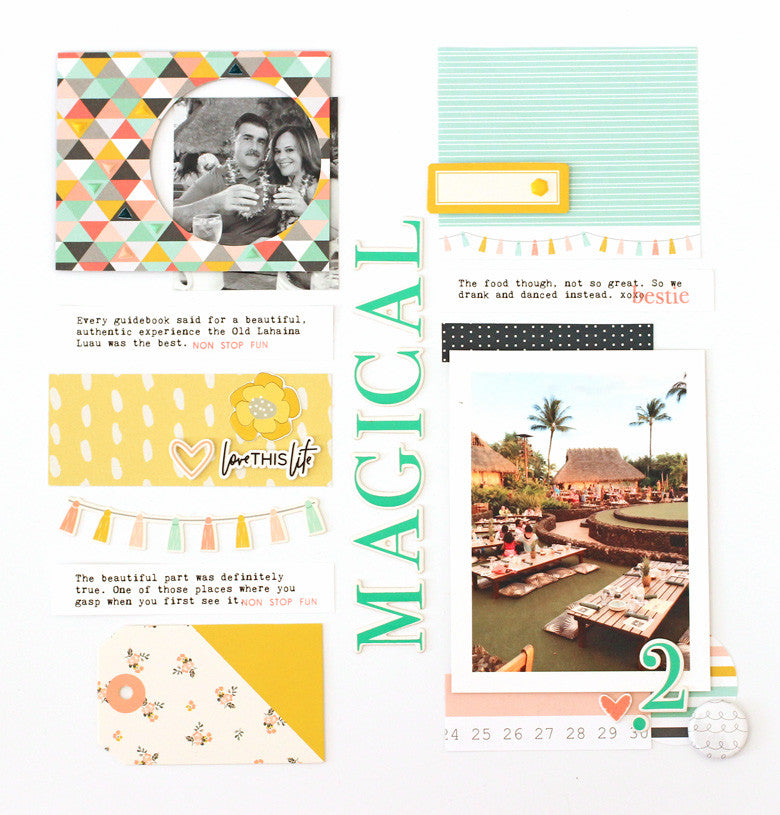
Begin by dividing the page straight down the middle with a bold title. Then start working in vertical lines to the left and right sides of that midpoint. Make sure that your photos and patterns are evenly distributed. You don't want too much weight on one side - it makes for lopsided designs! For example, if you place a photo at the lower right, balance it with another photo on the upper left like above.

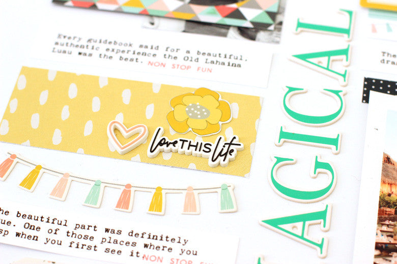
Mix up the widths and shapes of the stacked items in your vertical rows. This keeps the design from looking static (i.e. boring). Here is a rectangular strip of yellow patterned paper with a banner just underneath. This makes for an interesting design.
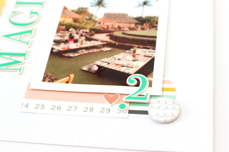
These designs tend to be a bit busy so make sure that you highlight the photo since that's where we want the focus to remain. Using strips of pattern paper to block the top and bottom of this vertical photo, along with layers of flair, circle-shaped patterned paper, chipboard and a heart rubber charm allow this photo to shine.
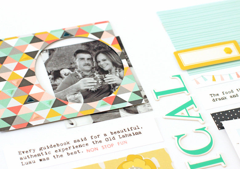
Repetition of shape (and contrasting ones) is really important when creating vertical layouts. Here, the two circles at the bottom right (in the flair and patterned paper shape) and mimicked in this frame. This creates symmetry as well. I love how it highlights this smaller photo as well.
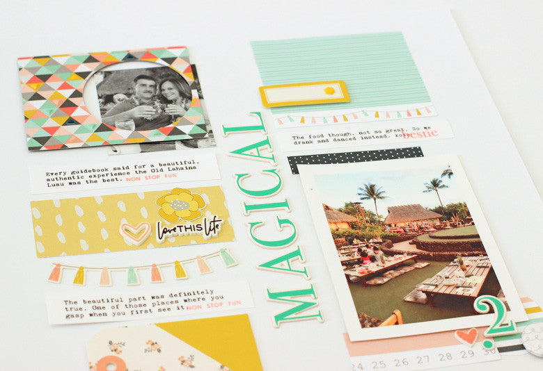
Vertical designs are a fun graphic look to experiment with. The Caroline kit with it's beautiful colors and embellishments is the perfect fit for this type of design!
SUPPLIES | Caroline Kit | Caroline Silicone Charms | Caroline Chipboard Alphabet | Caroline Bitty Puffy Shapes

1 comment
So neat and crisp looking! Love it!!